
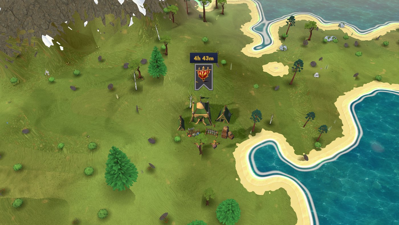
1.13 brings Muster Grounds, a brand new reason to march out every day, and gives almost every screen in the game a calmer, cleaner look where everything fits at a glance.
Short version: temporary Muster Grounds appear across the map and pay troops to whoever holds them. Gear, battle reports, clans, city info, settings and many more screens were rebuilt with fewer buttons and one clear main action. Attacking happens in a slim bar at the bottom, so the map stays in view. Chat gets animated stickers. And there is a long list of smaller improvements on top.
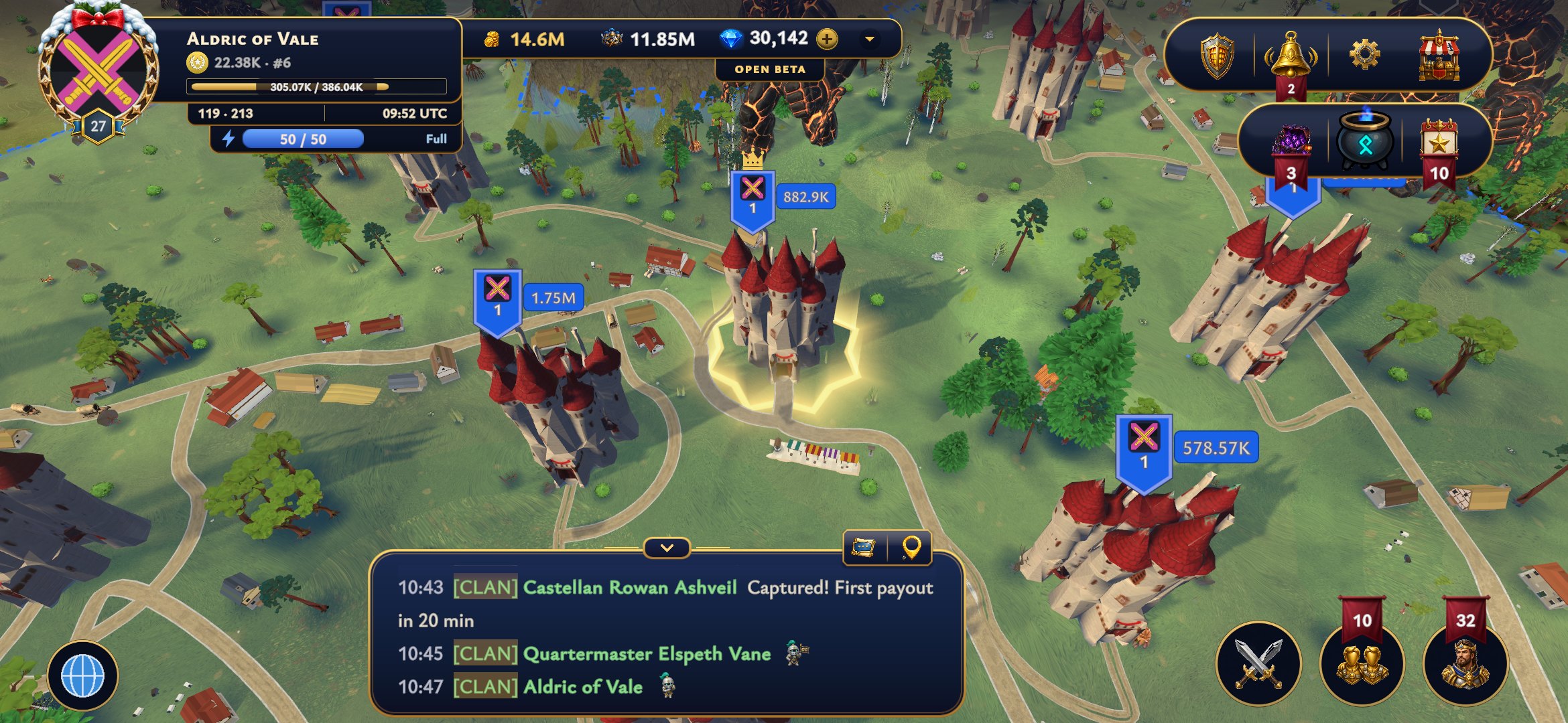
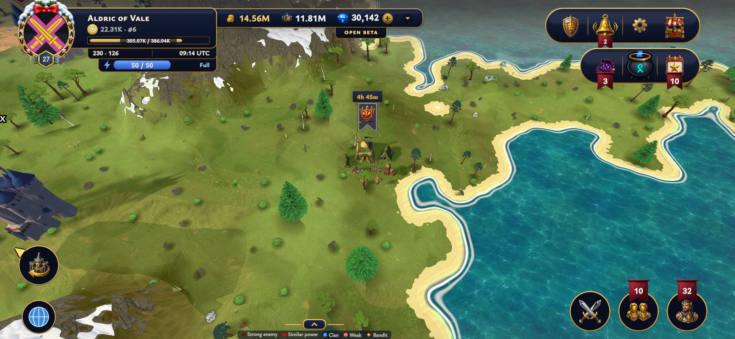 Muster Grounds are temporary war camps that pop up on every island. You will spot them by their banner, with a timer above it that shows how long the camp has left. Each one stays for a few hours, then packs up and disappears, and a new one appears somewhere else, so there is always one worth marching to. Keep an eye on the timer: a fresh camp is worth far more than one that is about to pack up.
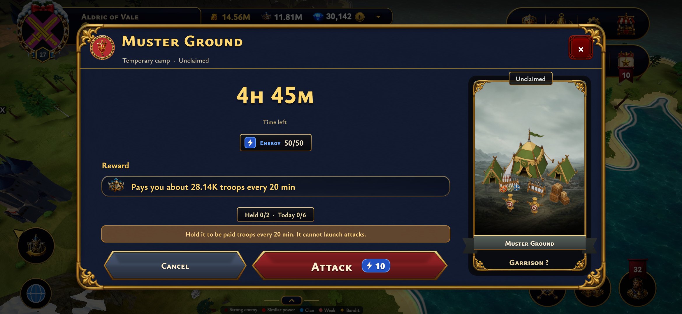 Capture one and it pays you fresh troops every 20 minutes for as long as you hold it, scaled to your own troop production and delivered straight to your capital. Tap a ground to see exactly what it pays you, how many grounds you hold, how many you have captured today and what the attack costs in energy.
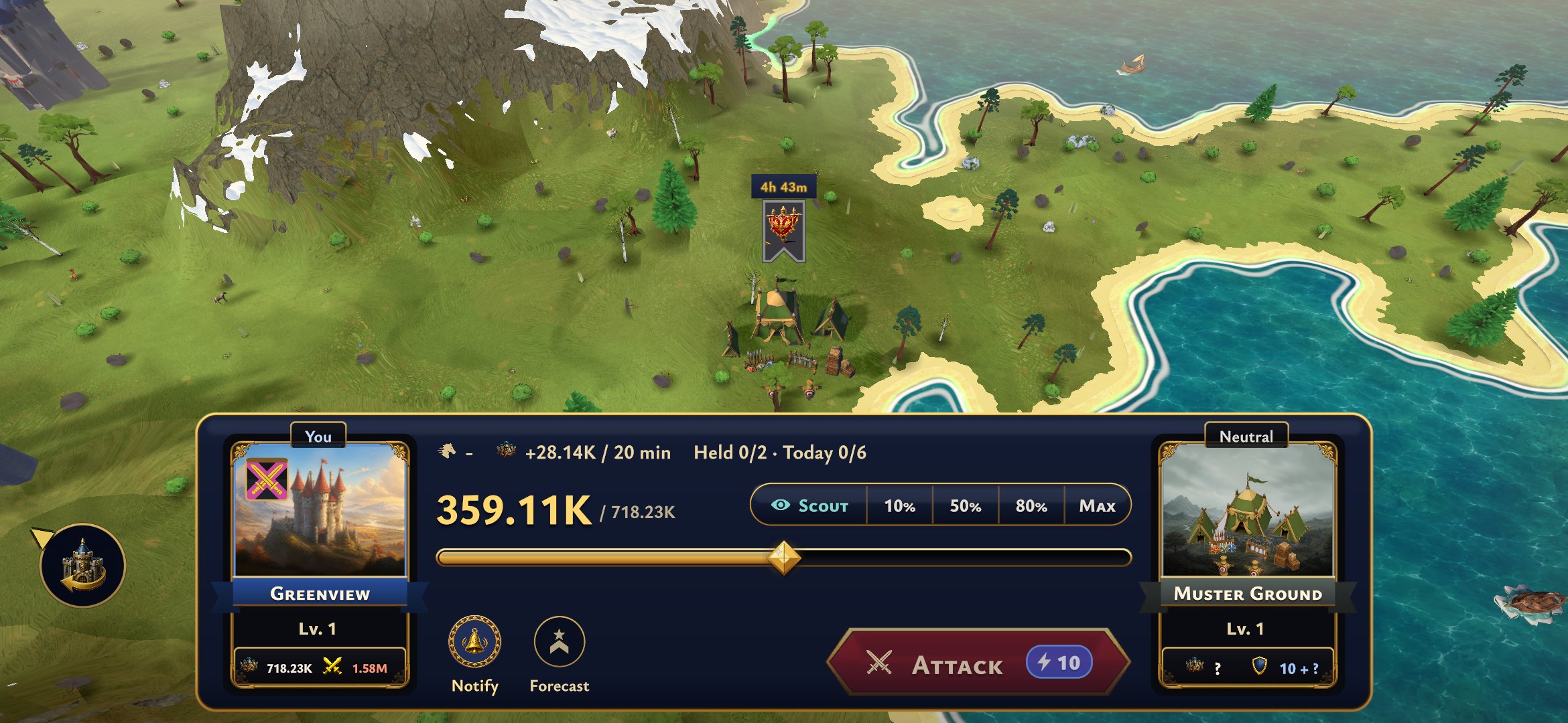 Holding one is the hard part. Other players can take it from you, so station troops in it and ask your clan or alliance to reinforce it. A Muster Ground is a camp, not a city, so you cannot launch attacks from it. When its time runs out you get your final payout and the garrison marches home on its own.
We went through the whole game with one rule: less is more. Fewer buttons, fewer tabs inside tabs, one clear main action per screen, and everything fits on screen at every UI size, including 120%. Tabs now glide, and their content slides in from the side you pick.
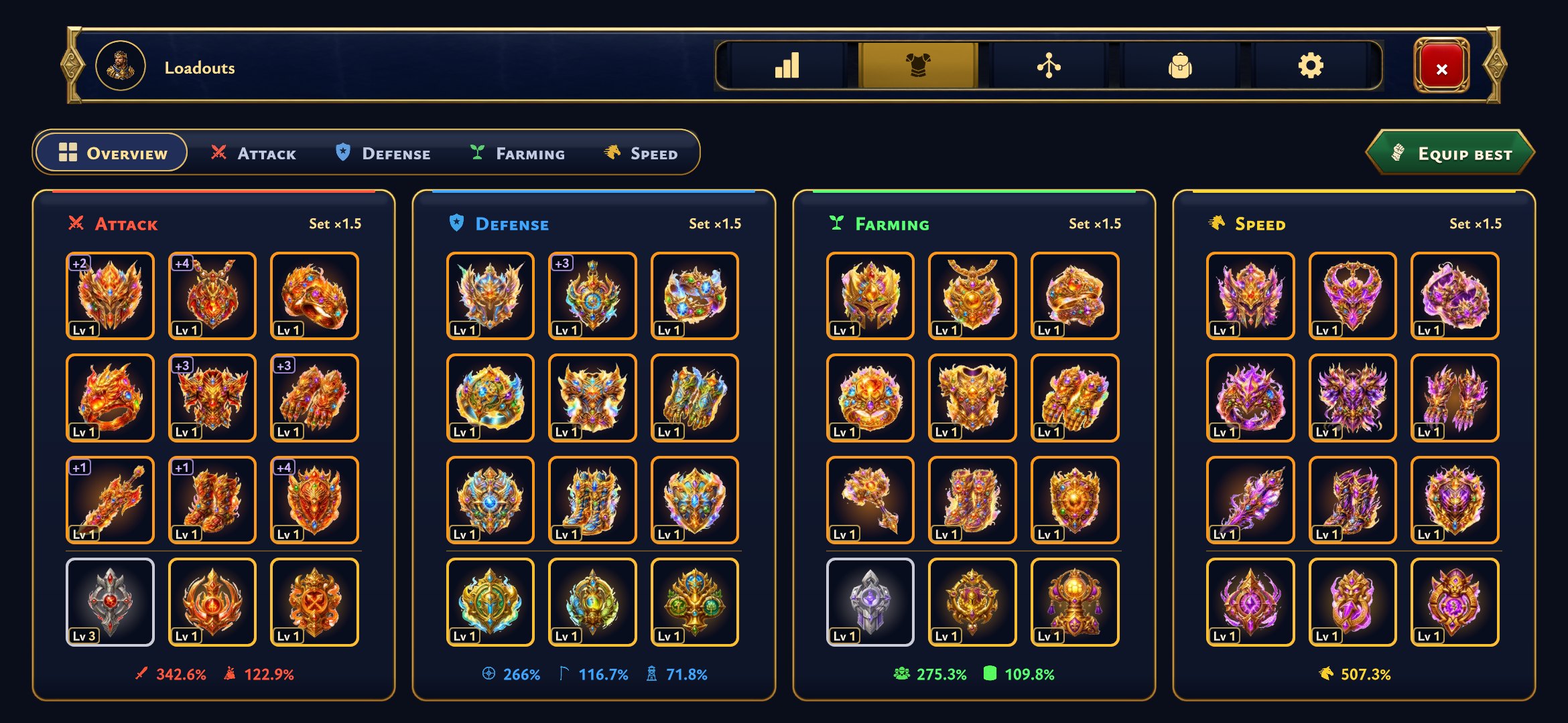 Gear is the biggest change. Gear and artifacts now share one view, sorted by loadout, every item shows its level at a glance, and Equip best sits right at the top. No more digging through tabs inside tabs to find out what you are wearing, and no more guessing which piece still needs an upgrade.
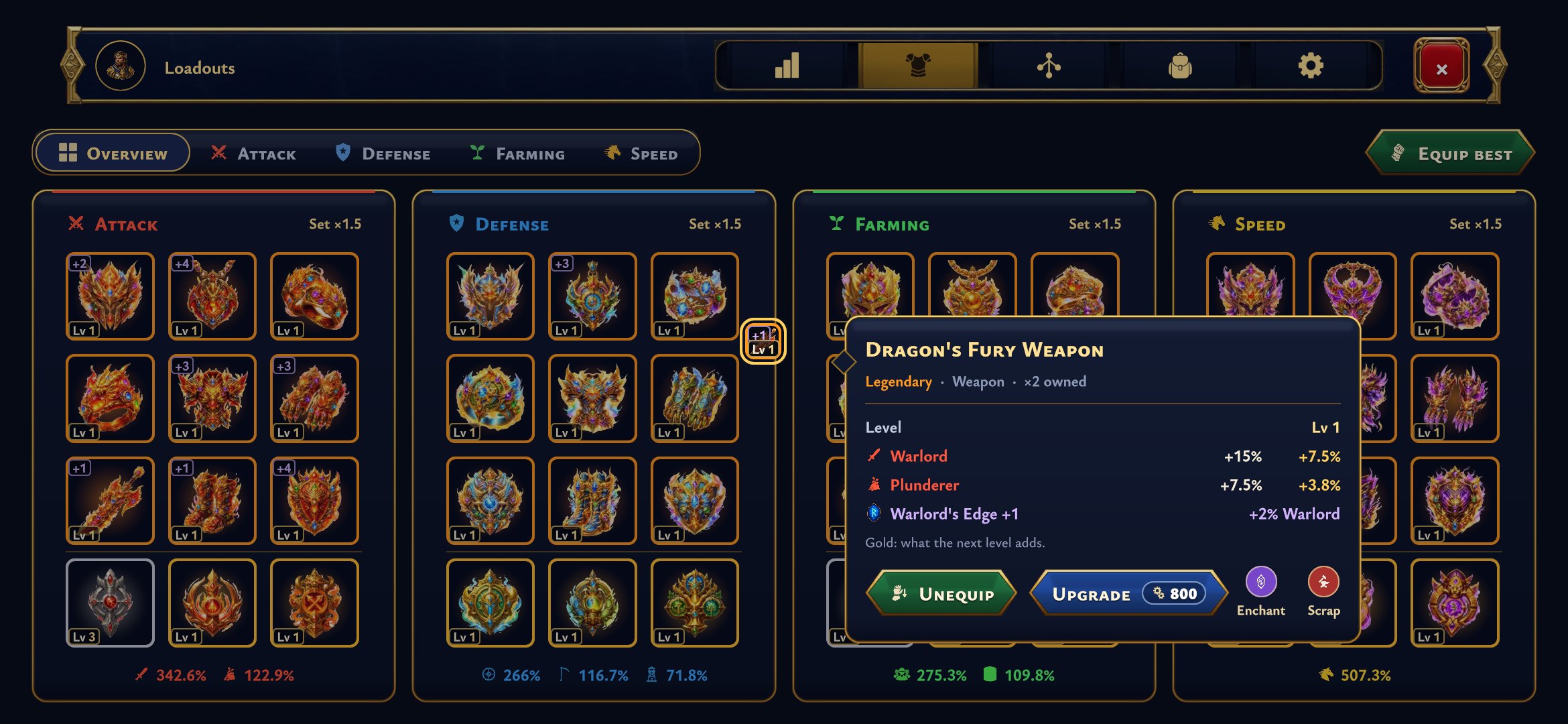 Tap any item and a compact card opens right next to it, with its level, its bonuses and everything you can do with it: Equip, Upgrade, Enchant and Scrap. The upgrade price sits on the button itself, so you never have to look for it. Enchant and Scrap sit right beside it, so the whole item is handled in one place.
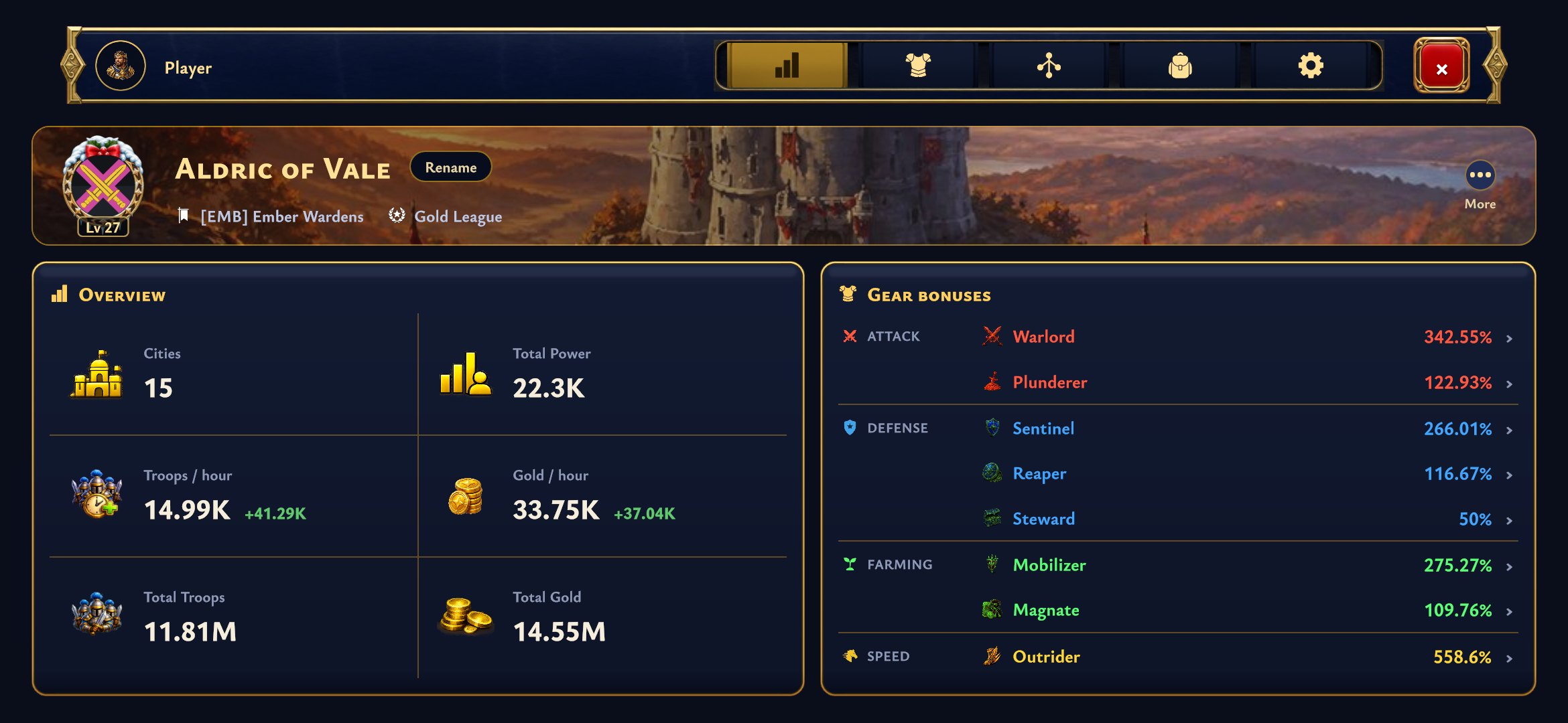 Your player overview shows your empire and all your gear bonuses side by side: cities, power, troops and gold per hour on one side, every attack, defense, farming and speed bonus on the other. Everything you want to know about your account fits on one screen, without scrolling.
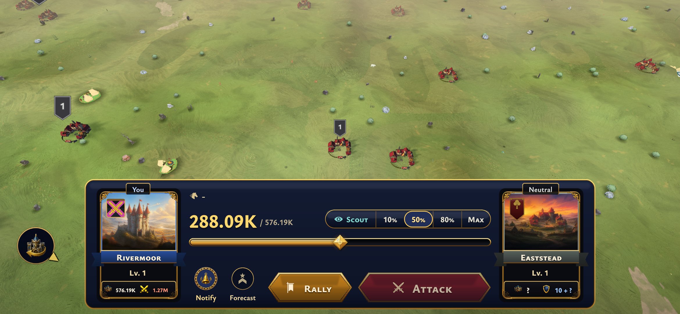 Attacking, scouting, reinforcing and sending troops now all happen in one slim bar at the bottom of the screen, so the map stays in view while you pick how many troops to send. Your city sits on the left, the target on the right, and the main action is always the big button in between. Pick a share of your troops with one tap, or drag the slider for the exact number.
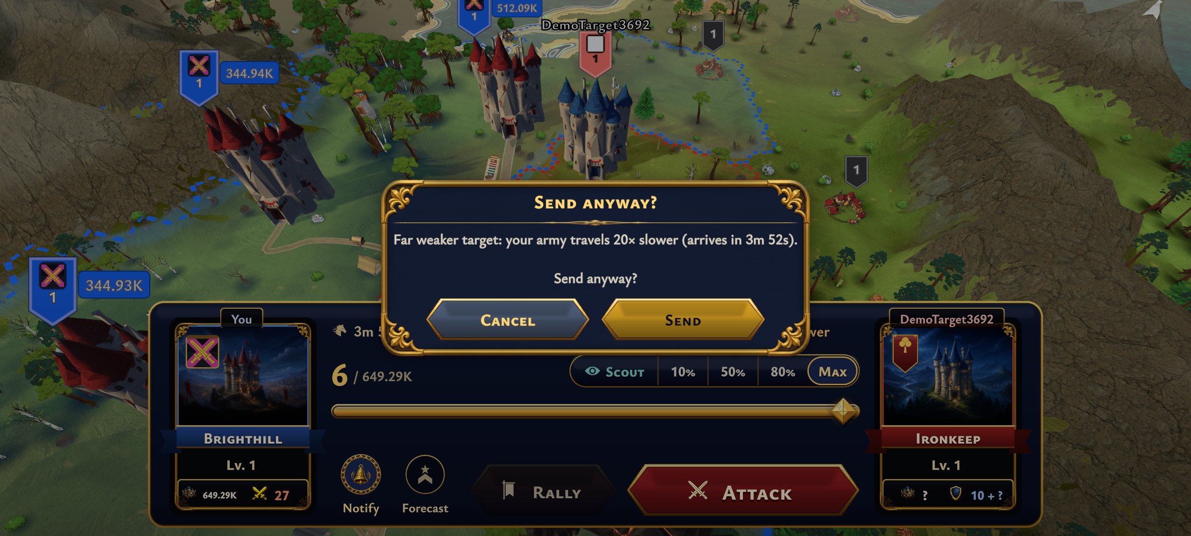 Sending your army against a far weaker target now asks you first, because your army travels a lot slower there. The bar warns you before you tap, shows how many times slower the march will be and tells you exactly when it would arrive, so nobody sends a whole army on a very long walk by accident.
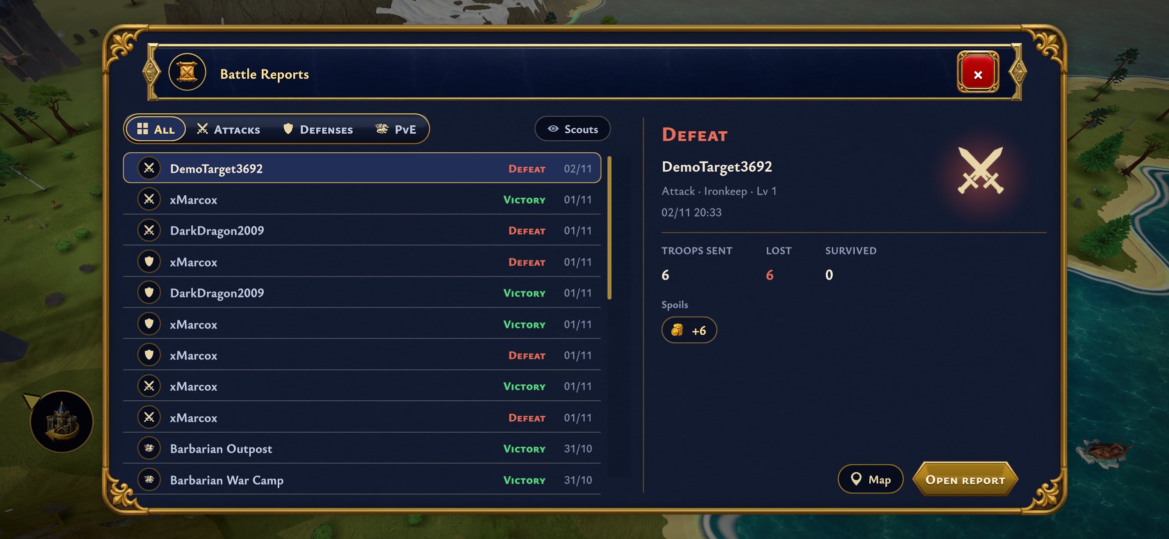 Battle reports open as a list with a preview of the selected report right next to it. Filter by attacks, defenses or PvE, skim your recent fights at a glance, and only open the full report when you want every detail. Scout reports have their own button at the top, and Map takes you straight to the spot where the fight happened.
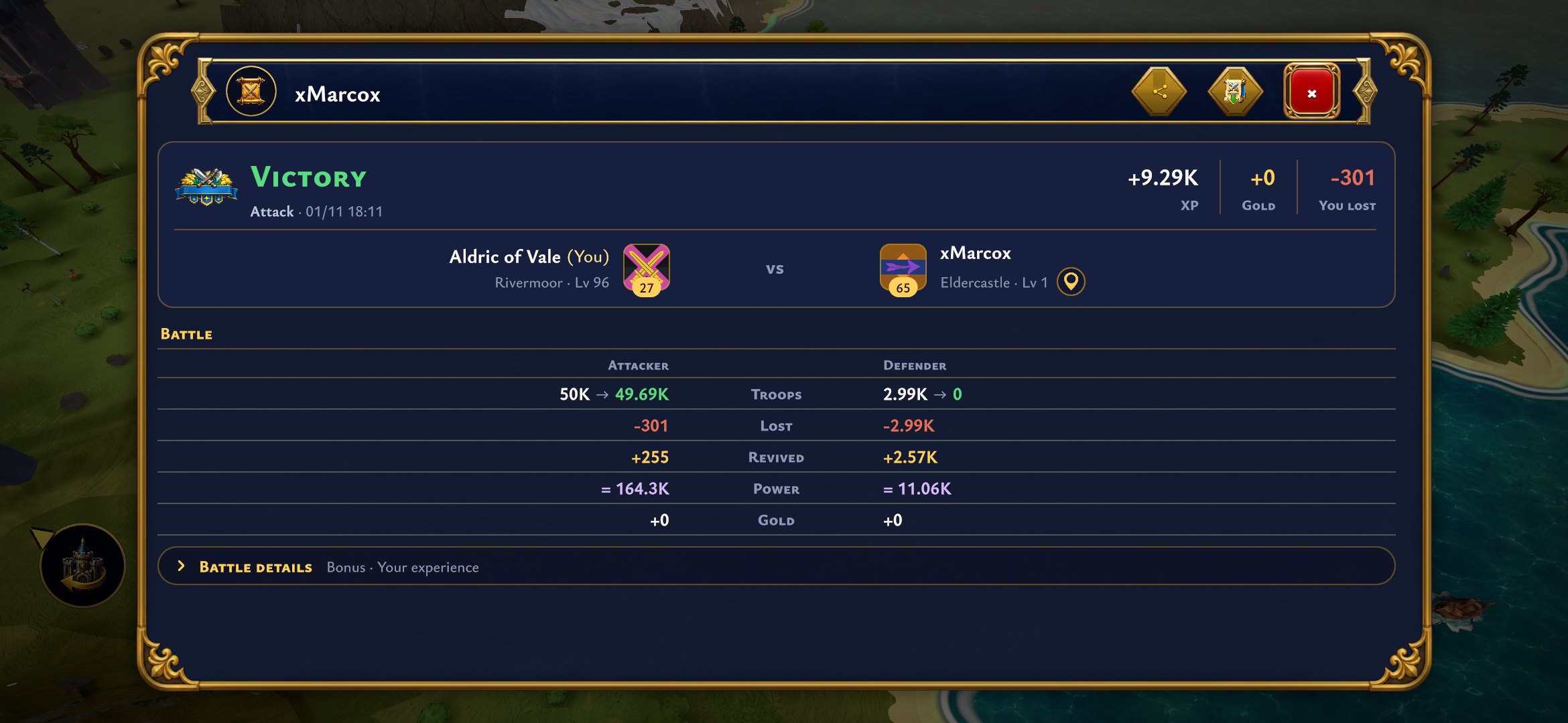 The full reports themselves are clearer for every kind of fight: PvP, monsters, sieges, rallies and scouts each get their own layout, with the result, the troops and the spoils up front. Nothing is left out, the extra details just sit one tap further down.
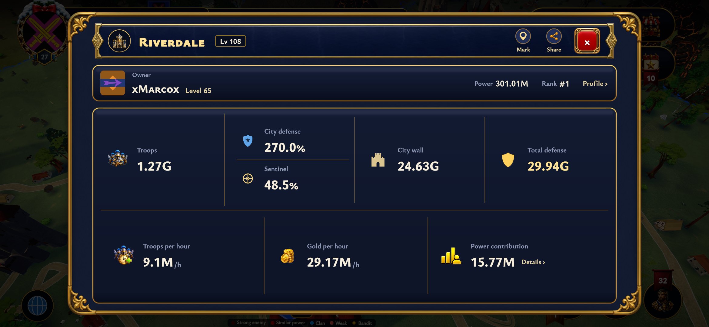 City info shows the key numbers of a city in one calm block: troops, defense, walls, production and power. After you scout a city you now also see the owner's Sentinel bonus on its own line, right under the City defense, so you know what you are really up against before you attack.
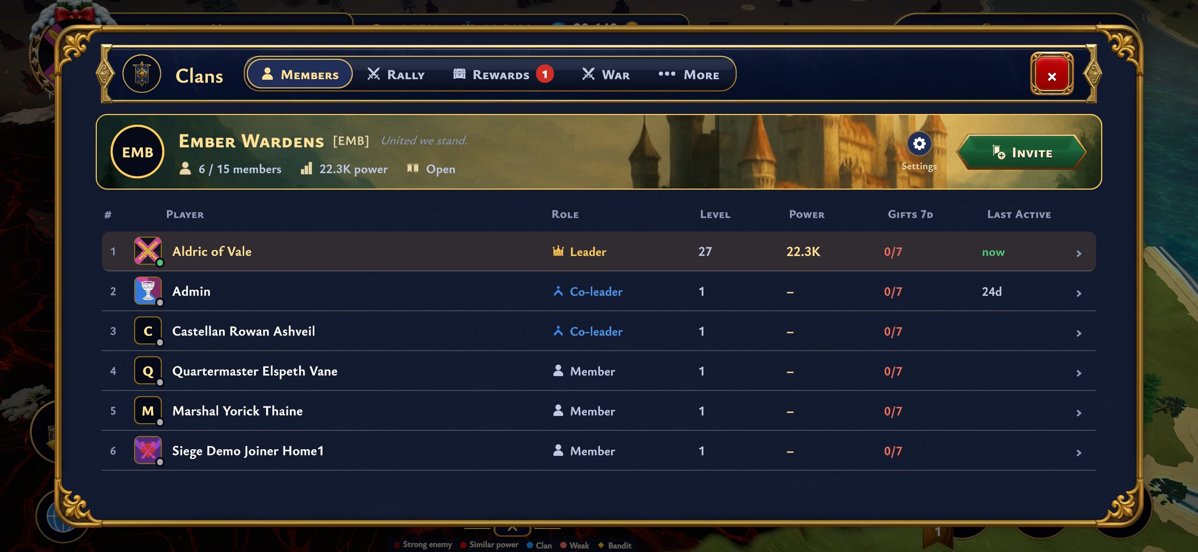 The Clans window got the same treatment. Your clan sits at the top with one clear Invite button, the member list shows roles, levels and power in neat columns, and members show as online again when they are actually playing. Rally, Rewards and War are each one tap away, and everything else sits under More.
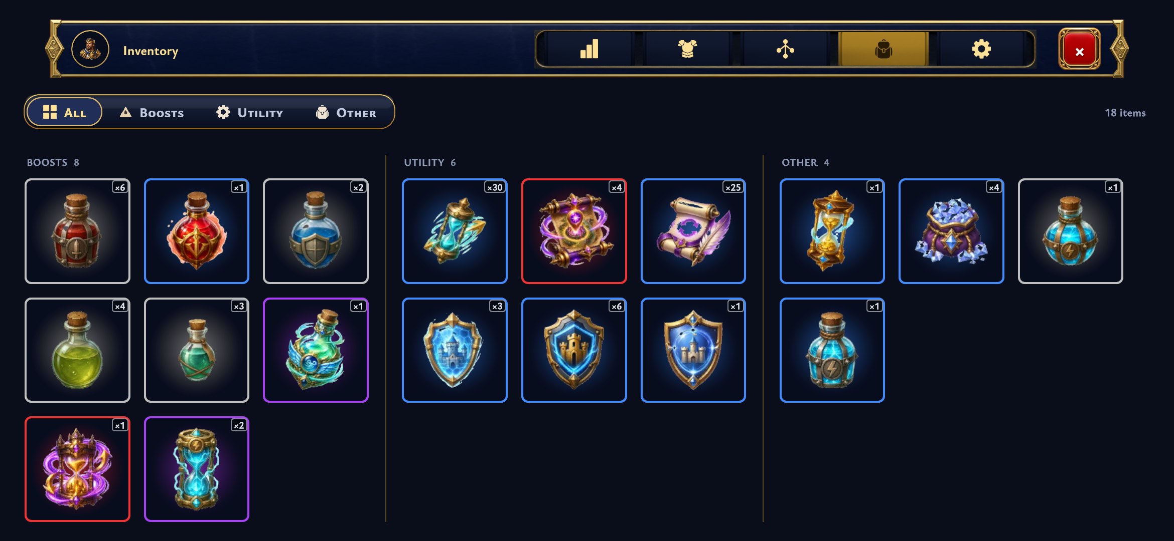 The inventory groups your boosts, utility items and everything else in clean rows with filters at the top. Tap an item for the same compact card you know from Gear, showing what it does and what you can do with it. A counter on every item shows how many you have left.
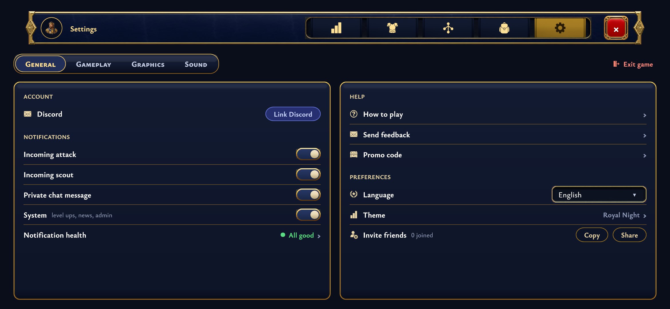 Settings are split into General, Gameplay, Graphics and Sound. Your account, notifications, language, theme and help all sit on the first page, and invite codes from friends now go in the Promo code box.
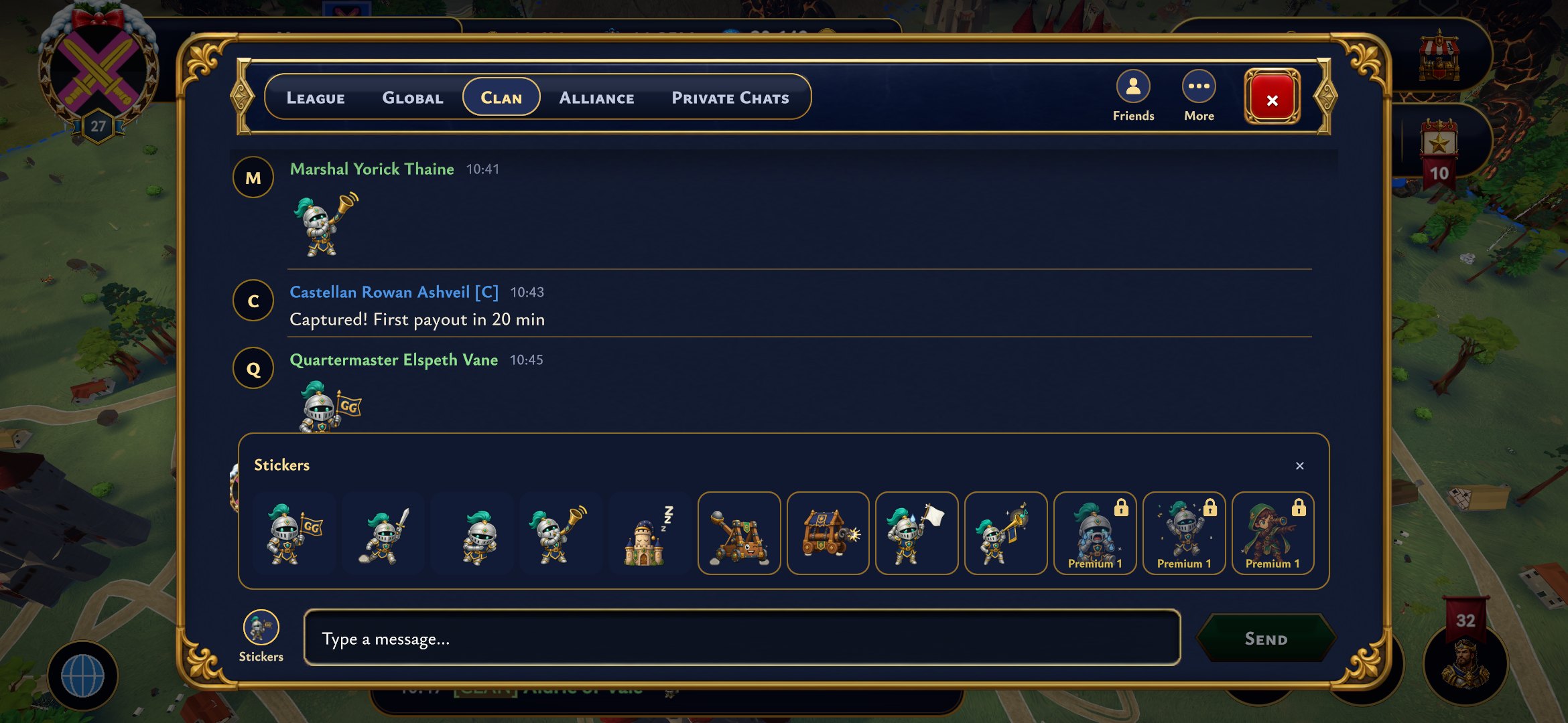 Chat got a compact new look. Every channel, League, Global, Clan, Alliance and your private chats, sits in one row of tabs at the top, so the messages get the rest of the window. Private chats keep their full history, Arabic and emoji show properly, and holding Backspace on your phone keeps deleting, with an emoji removed in one go.
 And there are stickers. Tap the Stickers button next to the message box and send an animated knight, castle or catapult instead of typing. They play in the chat window and in the chat preview on the map, so your clan sees your GG the moment you send it, even while they are busy with something else.
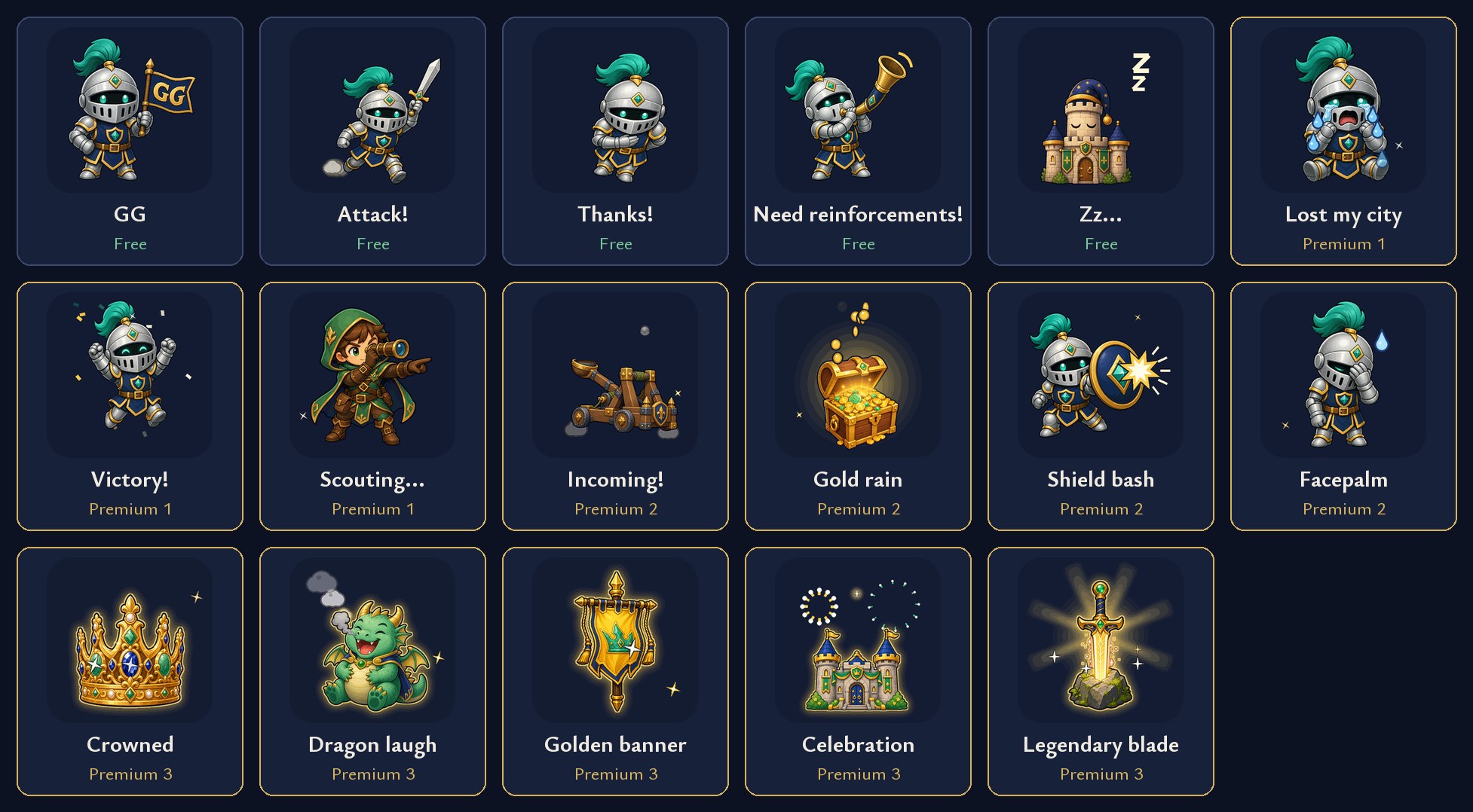 The first set has 17 animated stickers. Five are free for everyone, from GG to Need reinforcements!, and the rest unlock with a subscription: the higher your tier, the more stickers you can send. To keep chat readable, every player can send a sticker in a channel only every so often.
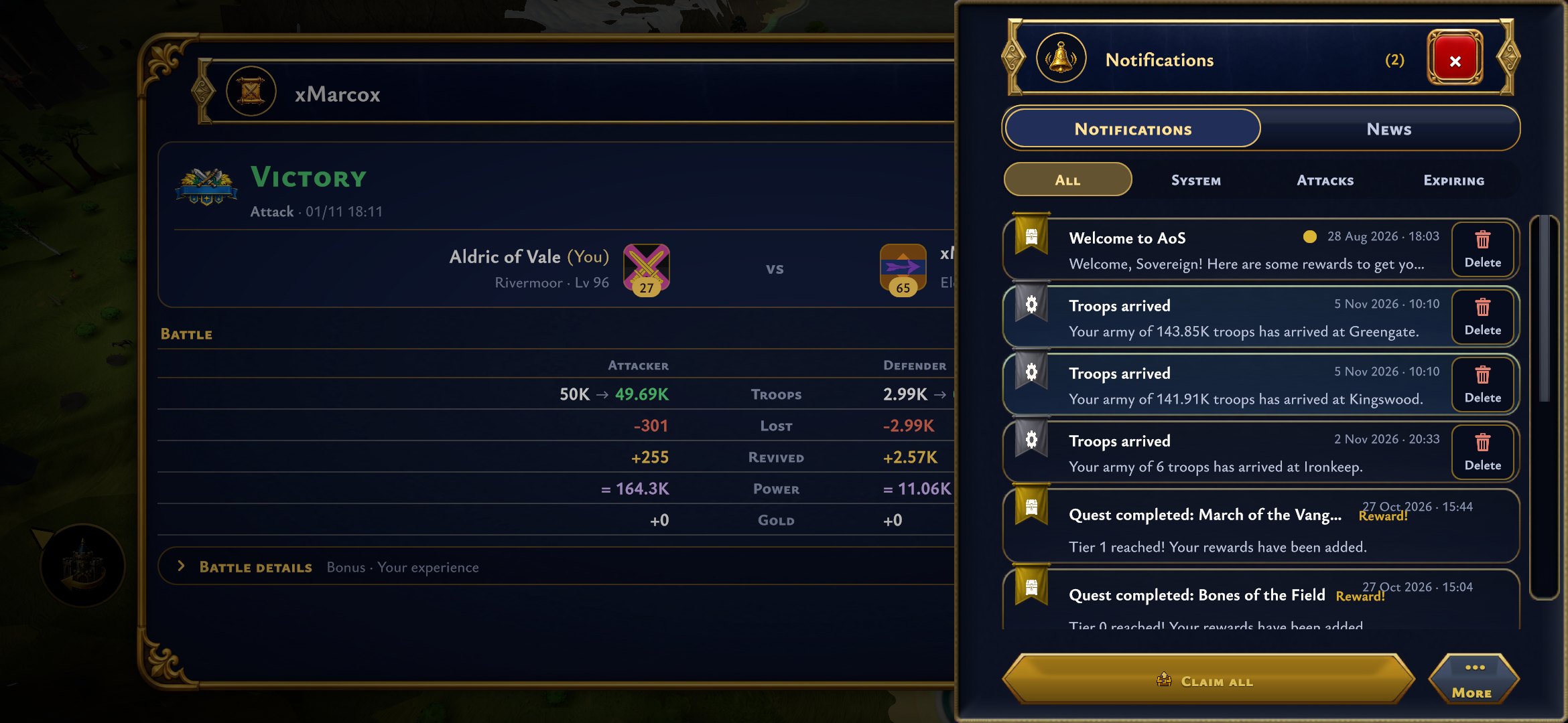 Every notification has its own Delete button, so clearing your mail one by one is quick. Notifications with a reward you have not claimed yet keep their place until you claim it, so you can never throw a reward away by accident. Filters at the top split your mail into system messages, attacks and anything that is about to expire.
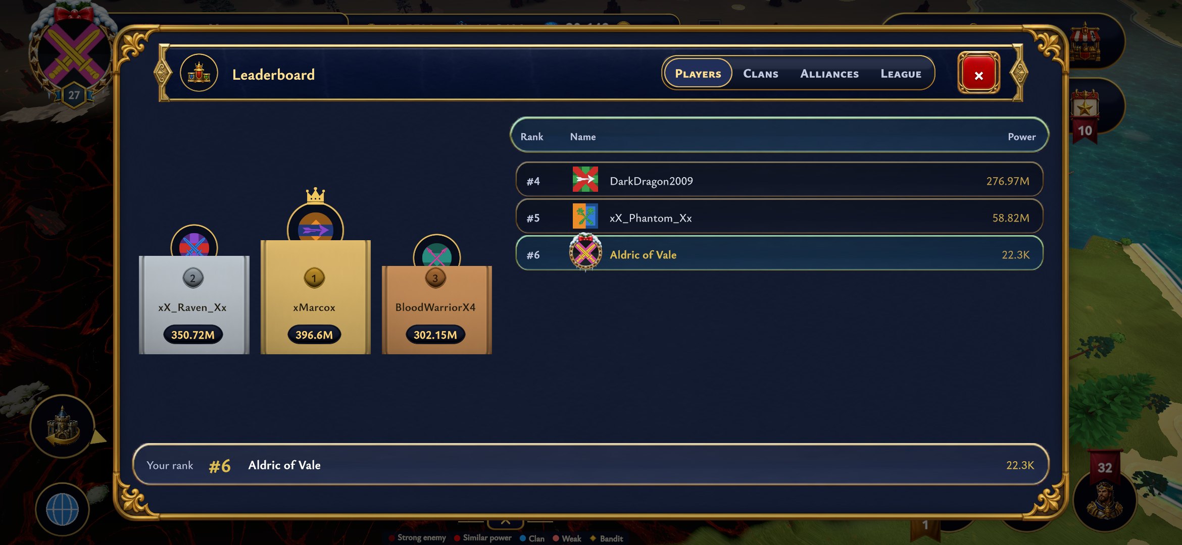 The leaderboard puts the top three on a podium and lists everyone else next to it, with your own rank pinned at the bottom. Switch between players, clans, alliances and your league with the tabs at the top, and tap any name to look at that player's profile.
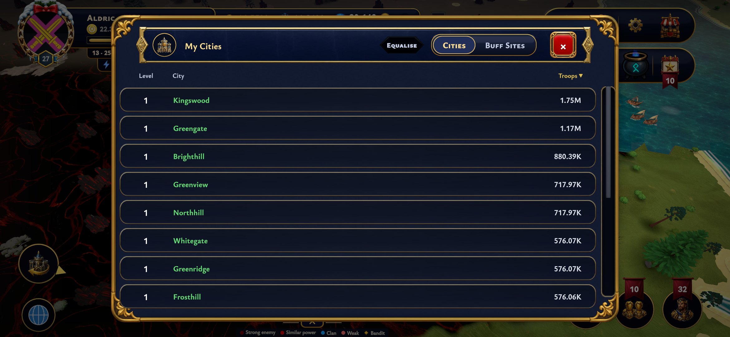 My cities is a compact table now, so each city takes far less space and you can see your whole empire at once. Sort it by troops or level, tap a city to fly straight to it, and use Equalize to bring a batch of cities up to the same level. It shows a cost preview before you confirm.
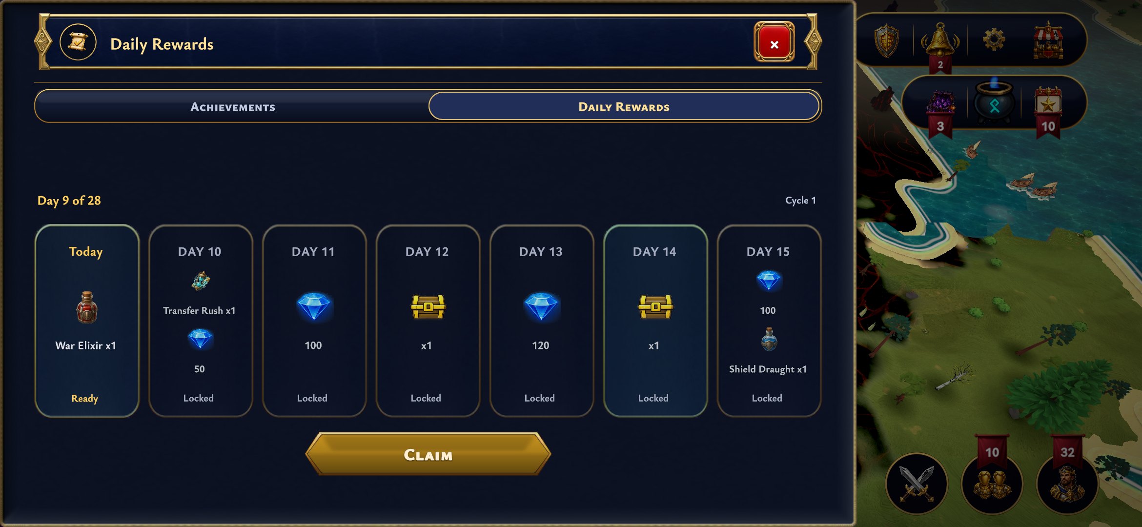 Daily rewards show the whole week ahead as a row of cards, with today's reward lit up and one big Claim button. Come back every day to keep your streak going through all 28 days of the cycle, with diamonds, chests and boosts waiting along the way.
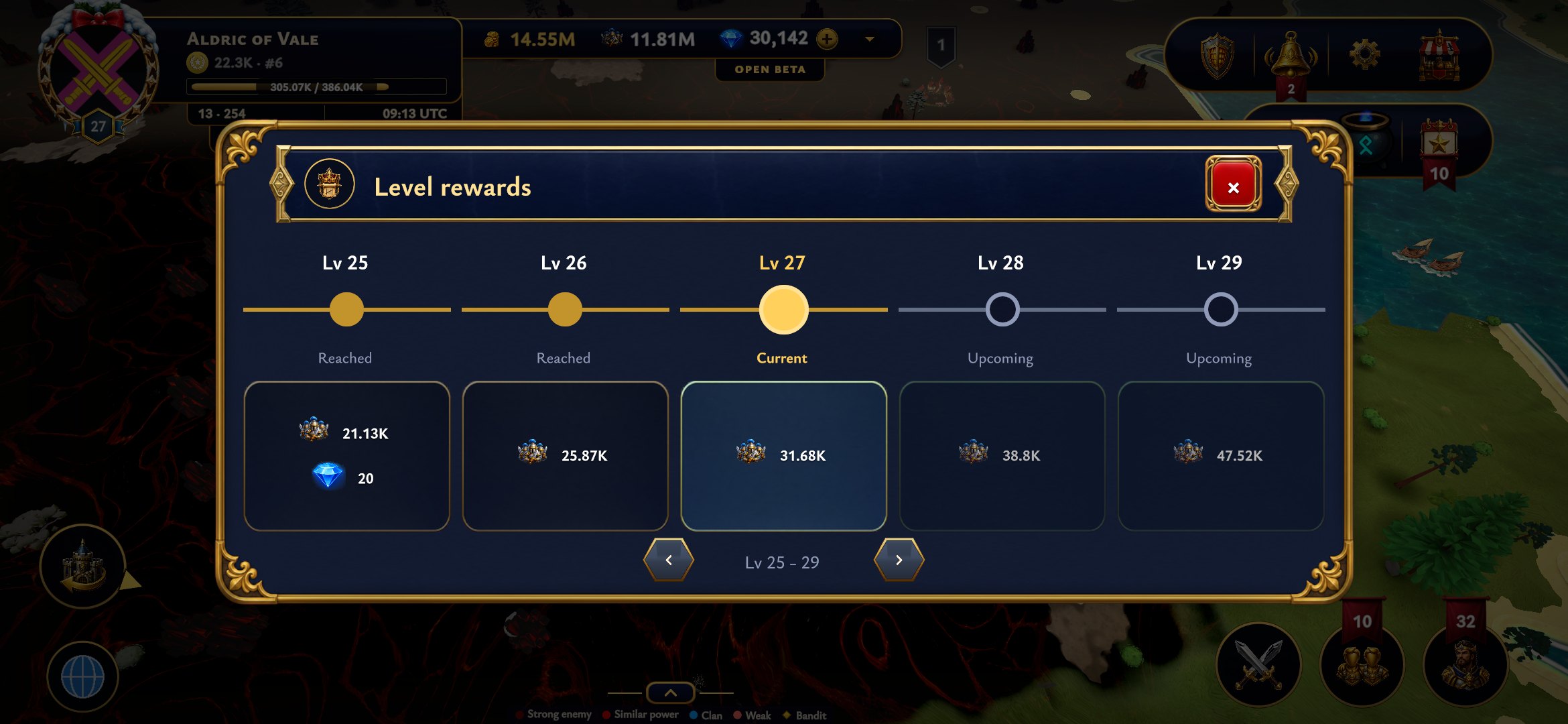 Level rewards follow the same calm style: a track of your levels with the reward for each one, the current level in the middle, and arrows to look further ahead at what is still waiting for you.
That is 1.13. See you on the map, and good luck holding those Muster Grounds.